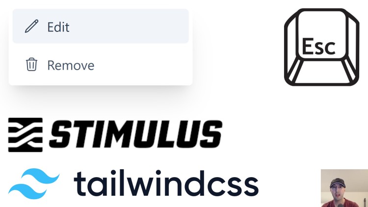
A Dropdown Menu Using Stimulus and TailwindCSS with Escape Key Support

The whole thing is about 10 lines of custom Javascript and it'll support using optional custom CSS transitions.
The video version of this post on YouTube shows a demo of building and using the dropdown menu.
Here’s a diff of changes from my open source Docker Rails example app which comes pre-loaded with Hotwire Turbo / Stimulus, TailwindCSS and more.
None of the below is technically Rails specific, you can drop it into any tech stack since Stimulus is a JS library. I chose to use the Rails example app in this post because my other Docker example apps don’t have Hotwire installed by default. Plus I really like Rails!
package.json
"el-transition": "0.0.7",
This is a fantastic library to support transitions in a way that’s compatible with Vue or Alpine.
What this really boils down to is a lot of TailwindCSS examples will expect you to provide classes for certain transition events that are named in a specific way. This library lets you add data attributes with those transition classes so everything matches up.
The whole library is ~60 lines of code which means it’s not going to add much to your JS payload. You can also choose to drop this dependency and not use CSS transitions if you want, but in my opinion when done tastefully it’s a nice UI enhancement.
You’ll see how this works down below in the JS and HTML.
app/javascript/controllers/dropdown_controller.js
import { Controller } from "@hotwired/stimulus"
import { leave, toggle } from "el-transition"

export default class extends Controller {
  // The "button" is the element that you click to toggle the dropdown.
  // The "menu" contains the dropdown menu items, this is typically a div.
  static targets = ["menu", "button"]

  /*
  / Toggle the visiblity of the menu based on if it's shown or not. The name
  / is not shadowed because our custom toggle method would be this.toggle(),
  / not toggle() which is supplied by el-transition.
  /
  / el-transition will hide or show this element (our menu) and apply the
  / transition classes that are defined as data attributes in the HTML.
  */
  toggle() {
    toggle(this.menuTarget)
  }

  // We only want to hide the menu when we click anything except the button.
  // This lets us click anywhere outside of the dropdown menu to hide it.
  hide(event) {
    const buttonClicked = this.buttonTarget.contains(event.target)

    if (!buttonClicked) {
      leave(this.menuTarget)
    }
  }
}
app/javascript/controllers/index.js
// Register the above dropdown controller with Stimulus.
import DropdownController from "./dropdown_controller.js"
application.register("dropdown", DropdownController)
app/views/pages/home.html.erb
<!-- data-controller associates this snippet of HTML to our Stimulus controller. -->
<div class="relative inline-block" data-controller="dropdown">
  <!-- data-dropdown-target defines this button as our Stimulus "button". -->
  <!-- data-action is where we wire up our events to execute our Stimulus methods. -->
  <button type="button"
          id="dropdown_example"
          class="inline-flex justify-center items-center"
          data-dropdown-target="button"
          data-action="click->dropdown#toggle keydown.esc->dropdown#toggle click@window->dropdown#hide"
          tabindex="0"
          aria-haspopup="true" aria-expanded="true">
    <svg xmlns="http://www.w3.org/2000/svg" class="h-4 w-4 inline-block text-gray-500 hover:text-slate-700" fill="none" viewBox="0 0 24 24" stroke="currentColor" stroke-width="2">
      <path stroke-linecap="round" stroke-linejoin="round" d="M12 5v.01M12 12v.01M12 19v.01M12 6a1 1 0 110-2 1 1 0 010 2zm0 7a1 1 0 110-2 1 1 0 010 2zm0 7a1 1 0 110-2 1 1 0 010 2z" />
    </svg>
  </button>

  <!-- data-dropdown-target defines this div as our Stimulus "menu". -->
  <!-- data-transition-* are the standard transition events, el-transition reads these. -->
  <div role="menu"
       class="absolute right-0 origin-top-right w-48 shadow-xl rounded z-1 hidden"
       data-dropdown-target="menu"
       data-transition-enter="transition ease-out duration-100"
       data-transition-enter-start="transform opacity-0 scale-95"
       data-transition-enter-end="transform opacity-100 scale-100"
       data-transition-leave="transition ease-in duration-75"
       data-transition-leave-start="transform opacity-100 scale-100"
       data-transition-leave-end="transform opacity-0 scale-95"
       aria-orientation="vertical" aria-labelledby="dropdown_example">
    <div class="bg-white rounded-md">
      <div class="p-1 space-y-1">
        <a href="javascript:alert('Edit');" role="menuitem" class="flex items-center space-x-2 rounded py-2 px-3 text-sm font-medium text-slate-600 hover:bg-slate-100 hover:text-slate-700 focus:outline-none focus:bg-slate-100 focus:text-slate-700">
          <svg xmlns="http://www.w3.org/2000/svg" fill="none" viewBox="0 0 24 24" stroke-width="1.5" stroke="currentColor" class="w-4 h-4">
            <path stroke-linecap="round" stroke-linejoin="round" d="M16.862 4.487l1.687-1.688a1.875 1.875 0 112.652 2.652L6.832 19.82a4.5 4.5 0 01-1.897 1.13l-2.685.8.8-2.685a4.5 4.5 0 011.13-1.897L16.863 4.487zm0 0L19.5 7.125" />
          </svg>
          <span>Edit</span>
        </a>
        <a href="javascript:alert('Remove');" role="menuitem" class="w-full flex items-center space-x-2 rounded py-2 px-3 text-sm font-medium text-slate-600 hover:bg-slate-100 hover:text-slate-700 focus:outline-none focus:bg-slate-100 focus:text-slate-700">
          <svg xmlns="http://www.w3.org/2000/svg" fill="none" viewBox="0 0 24 24" stroke-width="1.5" stroke="currentColor" class="w-4 h-4">
            <path stroke-linecap="round" stroke-linejoin="round" d="M14.74 9l-.346 9m-4.788 0L9.26 9m9.968-3.21c.342.052.682.107 1.022.166m-1.022-.165L18.16 19.673a2.25 2.25 0 01-2.244 2.077H8.084a2.25 2.25 0 01-2.244-2.077L4.772 5.79m14.456 0a48.108 48.108 0 00-3.478-.397m-12 .562c.34-.059.68-.114 1.022-.165m0 0a48.11 48.11 0 013.478-.397m7.5 0v-.916c0-1.18-.91-2.164-2.09-2.201a51.964 51.964 0 00-3.32 0c-1.18.037-2.09 1.022-2.09 2.201v.916m7.5 0a48.667 48.667 0 00-7.5 0" />
          </svg>
          <span>Remove</span>
        </a>
      </div>
    </div>
  </div>
</div>
That’s kind of a lot of HTML but if you break it down it’s not really too bad. I took these styles from https://tailkit.com and the SVGs came from https://heroicons.com.
# Demo Video
Timestamps
- 0:17 – Stimulus keyboard event filters
- 1:17 – The example Rails app we’re using is up on GitHub
- 1:46 – Going over the Stimulus dropdown controller
- 2:13 – The el-transition library handles common CSS transition patterns
- 4:41 – A quick primer on Stimulus targets and how it applies here
- 6:57 – How the hide action works when clicking around in the window
- 8:45 – Registering the dropdown controller in JS
- 9:29 – You can use TAB, Shift+TAB and Enter by default
- 10:53 – Going over the code diff for everything we covered
- 11:20 – Customizing a menu item with a different hero icon
- 12:12 – A light weight general purpose solution
Reference Links
- https://hotwired.dev/
- https://tailwindcss.com/
- https://stimulus.hotwired.dev/reference/actions#keyboardevent-filter
- https://github.com/hotwired/stimulus/pull/442
- https://github.com/nickjj/docker-rails-example
- https://github.com/mmccall10/el-transition
- https://tailkit.com
- https://tailwindui.com
- https://heroicons.com/
How would you have designed this dropdown menu? Let me know below.