BenQ RD320U 32 inch 4k Monitor for Programming
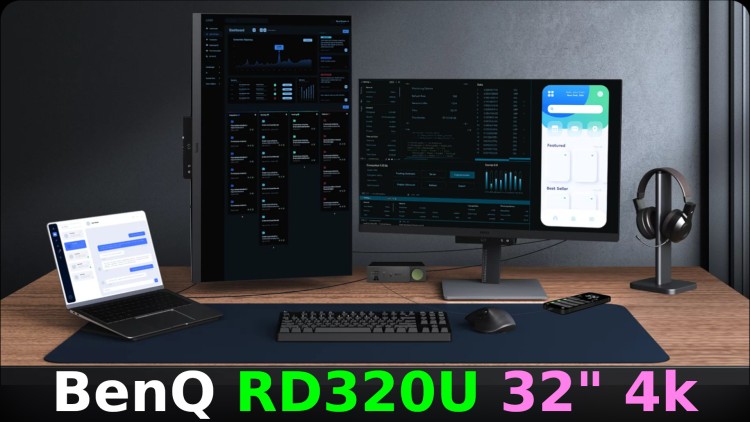
I tried out my first 4k monitor, here's the pros and cons based on using it for a month+ for software development and video editing.
Prefer video? Here’s an ad-free video on YouTube with the same details as this post.
Back in 2017 I wrote a post on how to pick a good monitor for software development. No one asked me to write that post but I felt compelled after finding, buying and using the monitor I chose back then. The tools we use as developers are important.
It turned out to be one of the most popular posts on this site.
Edit (2026): I’ve been using this monitor for over a year now and still happily use it.
# BenQ Gifted Me This Monitor
Just to get this out of the way, this is the first post in 9+ years and 500+ posts where a company reached out to me to request I write a review about their product and I accepted. They sent me the monitor for free in return for writing this post but I let them know I’d be writing an honest review and they were ok with that.
Just for transparency and context:
Over the years I’ve turned down $5,000+ worth of gear and services because I don’t want to suggest or recommend things I haven’t used personally or feel strongly about.
This situation is different. A monitor is a useful tool and I’ve always wanted to try a 4k monitor. If you read my other monitor post you know I was speculating to see if I could read text comfortably at 4k 100% scaling with a 32-36" monitor based on PPI calculations.
It would be silly for me not to accept BenQ’s gracious offer. If I didn’t then I would have eventually ended up buying a 4k monitor on my own.
Can You Trust BenQ?
Their name always comes up when looking for monitors and has been for 10+ years.
I never bought one of their monitors personally but I’ve only bought 3 monitors since 2007 which are a 20" Dell FP2007 (1600 x 1200), 25" Dell UltraSharp U2515H (2560 x 1440) and 24" ViewSonic VG2455-2K (2560 x 1440).
Prior to this BenQ monitor I was using the 25" Dell as my primary monitor, the 20" Dell as my secondary monitor and the 24" ViewSonic as a primary monitor with a company laptop.
With that said, I never purposely avoided BenQ. I just so happened to pick other vendors based on the research I did at the time.
Ok cool, now that all of that is out of the way let’s focus on the RD320U in an unbiased way.
One thing you can definitely trust is how well the monitor was packed on the inside:
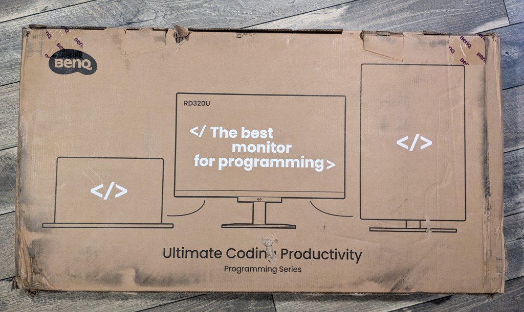
FedEx beat up the box pretty bad but there wasn’t a scratch or hint of damage despite the box looking like it had quite an adventure being shipped from California to New York.
I have to admit, the box impressed me because seeing the bold white text on the brown box already gave me a feeling that BenQ’s attention to detail is going to be quite high. Even the box has readable text which lives up to this monitor’s main feature!
# Quick Specs
This is for the RD320U which is the monitor I’ve been using.
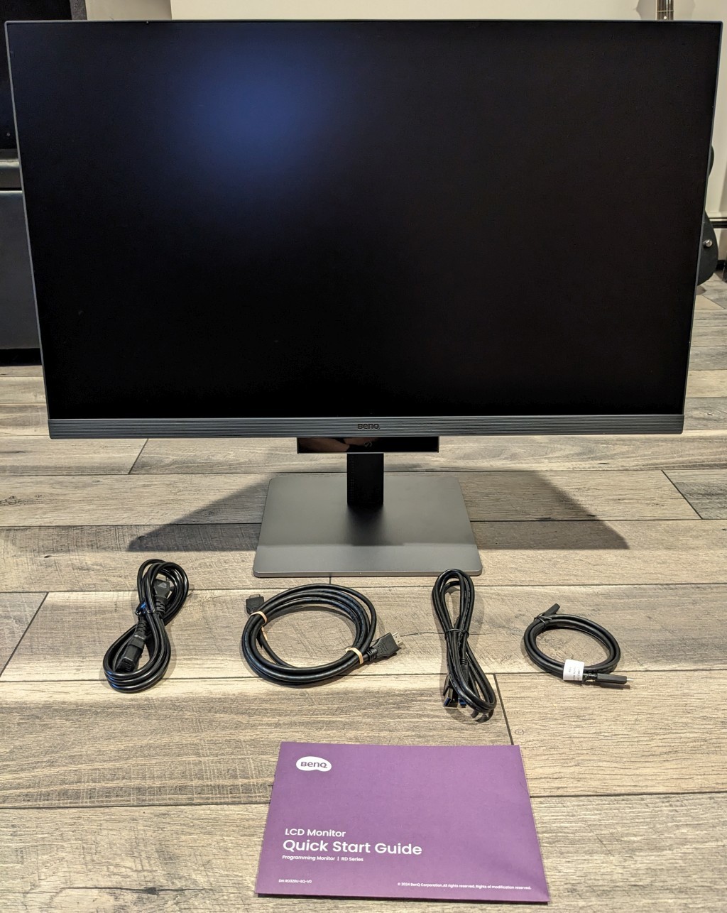
- 32" / 4k (3840 x 2160) / 137 PPI
- 60hz IPS panel (Nano-Matte / anti-glare finish)
- 2000:1 contrast ratio
- Optional backlight glow
- A bunch of connection types ([2] USB-C 3.2, [2] HDMI 2.0, [1] DisplayPort 1.4)
- To achieve 60hz, make sure your video card supports one of the following:
- DisplayPort 1.2+, HDMI 2.0+ or USB-C
- To achieve 60hz, make sure your video card supports one of the following:
- Built in KVM switch
- This lets (2) computers toggle between (1) monitor + keyboard + mouse
- BenQ has a video and FAQ on their site going over how it works
- This lets (2) computers toggle between (1) monitor + keyboard + mouse
- Adjustable stand (alternatively the “UA” model has a mountable arm)
- 23.8 lb / 10.8 kg (with the base stand)
As of late 2024 it’s listed for $650 USD but this may change over time.
Input Lag?
This is the amount of delay between performing input (moving the mouse, typing a key, etc.) and seeing it update on the screen.
As someone who has played first person shooters at competitive levels I tend to be pretty sensitive to any type of latency whether it’s coming from a keyboard, mouse, monitor or network. For context, back in the day I used to put custom teflon pads on the bottom of my mouse feet to reduce friction. I cared that much.
I don’t have the hardware to officially measure input lag on a monitor and at the time of writing this post, the monitor is so new that these specs aren’t posted anywhere. BenQ also doesn’t officially list this spec but I found that to be true for most monitor vendors, especially when the monitor is marketed for office / desktop use and not gaming.
I can say this, from a practical stand point I don’t notice a difference between this monitor and the 25" Dell which I know has been measured at 13ms which is quite low. I have used monitors outside my personal set ups where I noticed a delay.
That’s good news.
What About Ghosting?
I don’t see any when something is running at 60+ FPS.
Dead Pixels
I never dealt with a dead pixel on any monitor and technically this monitor didn’t have one but my stomach temporarily sunk when I plugged it in because there was a white stuck pixel in a very noticeable area of the screen.
I wanted to call this out because as soon as I changed my Windows settings to set this new monitor as my primary display the stuck pixel disappeared and functioned normally.
I don’t think this is a BenQ specific thing or a problem with this specific monitor but if you happen to encounter the same thing on any monitor, don’t freak out immediately. Turning the monitor off and on or toggling it as your primary display may fix it.
Speakers
Technically the monitor has built-in speakers but I didn’t list that in the quick specs. I say technically because I was looking forward to them because I don’t have speakers or wireless headphones and sometimes it’s nice to be able to listen to music without being bound to headphones such as when cleaning.
I don’t want to trash BenQ too hard here but let’s just say having monitor speakers you’ll never use is better than not having them because having a 2nd sound output is helpful if you ever need to troubleshoot if your headphones are broken or your system’s sound is messed up so it is better than not having them.
Fortunately when it comes to the monitor doing monitor things like displaying text, images and videos with clarity and accuracy it’s really solid. Let’s get to those details!
# 32" 4K at 100% Scaling, Is It Doable?!
I’ll save you the suspense, yes it is doable.
This was by far the most interesting thing I was looking forward to seeing.
Going from 2560 x 1440 to 3840 x 2160 is a lot of extra screen real estate but you only get that extra space if you run at 100% native scaling.
As soon as you go above 100% native scaling you lose effective space. Here’s a few popular scaling percents with 4k and their effective resolutions:
- 4k @ 200% == 1920 x 1080
- 4k @ 150% == 2560 x 1440
- 4k @ 125% == 3072 x 1728
- 4k @ 100% == 3840 x 2160
If it helps, you can visualize 4k at 100% scaling as having (4) 1080p screens together in one display layed out in a 2 x 2 grid. It’s a lot of space (in a good way)!
Personally I wouldn’t bother getting a 4k monitor to run it at 150%. At that point you might as well get a 2560 x 1440 monitor. It will be easier to power for your GPU and more bang for your buck if you want a higher refresh rate.
Now to be fair, with a high enough PPI (pixels per inch) typically as you increase scaling then things will get smoother but I don’t think that’s a trade off worth making. I value screen real estate more than extra smoothness but that’s just me. You might be different.
125% is pretty interesting though, I mean it’s ~500 extra horizontal and ~300 more vertical pixels than 2560 x 1440 so it is an upgrade but 100% scaling is so much more.
With that said, at 28" / 70 cm away from the monitor I can pretty comfortably read all text at 100% scaling. My normal terminal font size is 10 with the Consolas font.
I say “pretty comfortably” because it’s not perfectly effortless. I don’t notice any eye strain after hours of use but I can tell my brain perceives certain text as kind of small.
If I were sitting further back I don’t think I could roll with 100% scaling, once I get about 36" away then my terminal font gets too small for comfort without strain. I don’t think it would be usable for extended periods of time at that distance.
I’m going to continue using 100% given my current desk isn’t deep enough to let me move the monitor further than 28" and I don’t want to get an arm to mount it.
Perhaps 34-36" at 100% scaling would be perfect but 32" is already physically huge. Also, as you go physically larger then your PPI is less which can make text look less sharp.
A 25" 1440p monitor has 117 PPI and this 32" 4k monitor has 137 PPI, having 36" at 4k would be 122 PPI so it wouldn’t be any worse off than 25" at 1440p but I will say having 137 vs 117 is noticeable when it comes to text clarity. I can say without a doubt text at 100% scaling on this 4k monitor looks better than my old monitor. Text is more clear and sharp.
# 32" Is Massive Compared to 25"
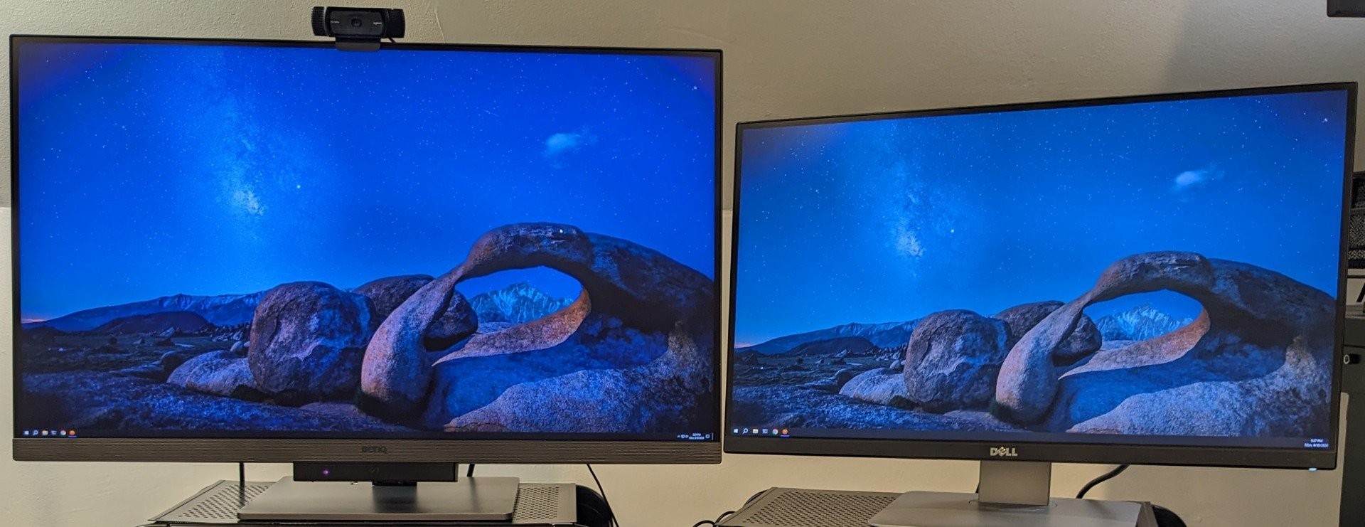
Note, that purple glowing dot under the BenQ logo is a sensor my camera picked up for detecting brightness since the monitor can optionally self-adjust its brightness if you turn that feature on. It is not a full blown camera spying on you but I still covered it with tape because that’s how I am.
When I put the monitor on my desk my first impression was what the heck did I get myself into haha. It was almost comically large compared to my 25" monitor.
You might think well it’s only a few more inches in each direction from a centered view but that makes a world of a difference, especially at the distance I’m standing or sitting from.
At 28" away I find myself having to move my head a little bit to see the 4 corners of the screen. With the 25" monitor at 28" away I had to move less. Technically my eyes can scan the whole screen with no head movement with both monitors but it doesn’t feel natural to move my eyes that much. I’m not a lizard.
2nd Monitor Upgrade
This is a side topic that relates to the new 32" monitor.
With the old set up, having a 25" 2560 x 1440 and 20" 1600 x 1200 monitor side by side was actually pretty nice. The height of the viewing space for both monitors was nearly the same, they both easily fit on my desk and it was natural to look at either monitor when they were both facing straight forward (I always placed myself in front of the left / main monitor).
With the new set up, the 32" monitor is really 28" horizontally and the 25" monitor is really 22.5" horizontally (50.5") and my desk is 48". If you put them side by side then they hang off the edge of the desk a little. That’s not too bad in practice but having them both face fully forward makes looking at the 2nd monitor difficult, you have to move your head so much.
That’s why in the above picture you see I angled the 2nd monitor towards me, it helps quite a bit when glancing at it. With that said, I do find myself creating new habits to only really use the left side of the 2nd monitor.
Overall I find this to be mostly an upgrade from a 2nd monitor perspective. At least now I’ve finally retired using a DVI connector, I’ve been holding onto that for almost 20 years!
# Desktop Usage and Common Apps
Does 4k really make that big of a difference? I think so but it comes with its own set of time sinks like fiddling with window positions more than you might with at 1440p.
Overall it’s a net win because it feels like I have 3 monitors now instead of 2 because for a number of use cases I view multiple things on the 4k monitor that I normally would have split across 2 monitors before.
There’s also an interesting takeway when it comes to being able to tile more windows at once vs having a tabbed set up. We’ll cover that in more detail later.
For now let’s go over window layouts for doing specific tasks.
Every Day Tasks
These are things like browsing the web and navigating around / using your OS.
For browsing the web I find myself gravitating towards using the middle of the monitor because having a maximized 4k display has a lot of unused horizontal space for a lot of sites. A lot of sites nowadays have a max width page that’s centered.
The extra vertical space is always a win though, it makes it faster to view information since you can see more at a glance without needing to scroll down.
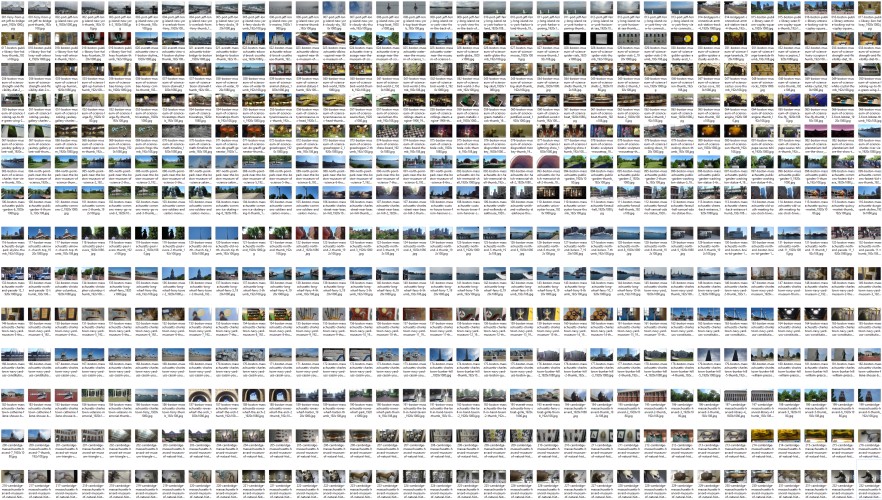
For certain things like browsing image galleries the extra full screen space is nice. You can see so many more thumbnails at once. I was looking at a bunch of pictures I took on a few trips and it was surprising at how many I could see in 1 screen without scrolling:
With Windows 10, viewing “large icons” with the Windows explorer side bar visible:
- 3840 x 2160 shows 429 thumbnails
- 2560 x 1440 shows 189 thumbnails
- 1920 x 1080 shows 105 thumbnails
This really demonstrates how much bigger 4k is vs 1080p and even 1440p. The exact amount will of course differ depending on how long your file names are and the uniformity of the image sizes but the percent ratios should be comparable between resolutions.
For example, here’s being able to see 462 thumbnails at 4k in 1 view:
Coding
There are some pretty big wins here!
At the font size I use, I can fit (6) side by side code buffers at 80 characters without overlap. There’s also 128 vertical lines that are visible. Here’s a 4k screenshot:
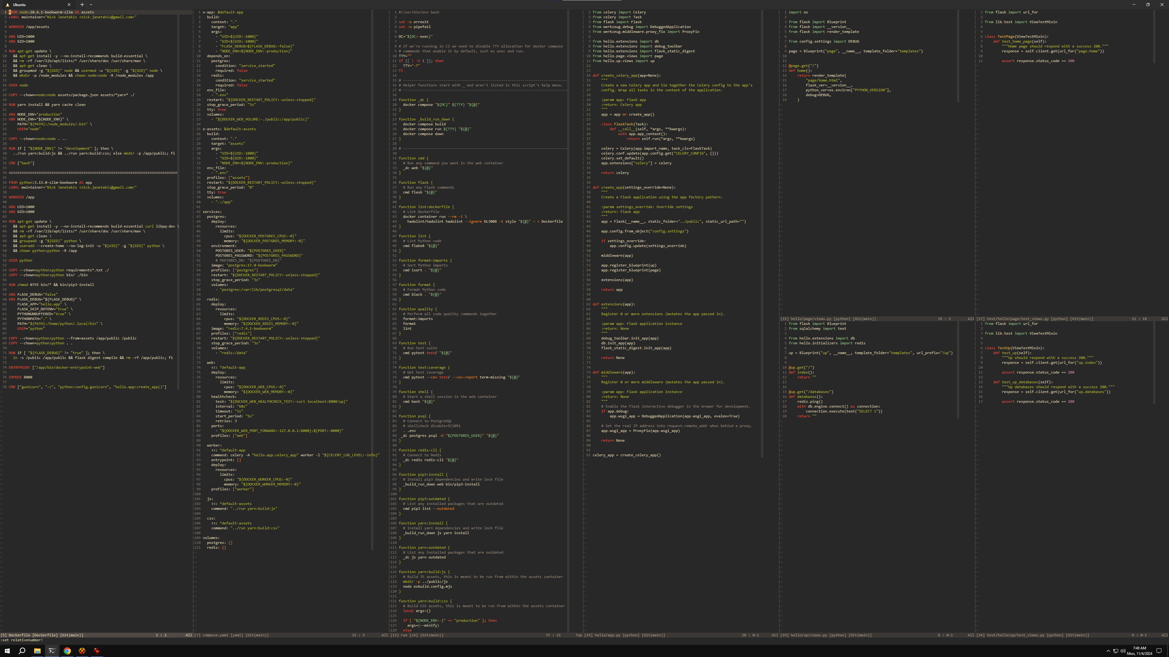
For comparison at 1440p I was able to fit (4) side by side code windows and 82 lines.
Having that much extra space is nice. You can mix and match depending on what you’re doing. Maybe you want 3-4 code windows side by side with a terminal next to them, that leaves your 2nd monitor to have a browser for web development previews or docs.
With the 1440p set up I usually had my terminal running in a 2nd tmux window which meant I can only see either my code or the terminal at once but sometimes that’s hard to work with because I often want to see and modify the code I’m working on at the same time as my terminal such as when working in a console.
Also, the extra vertical space is a pretty big quality of life win. Being able to see that many lines at once helps you get the big picture of a file at a glance. You also have the option of splitting windows horizontally if you have a use case where you want many windows open and tiled at once.
Writing Blog Posts
Here’s a layout of me writing this blog post with a real-time preview on the right. I like keeping what I’m writing centered. On the left I have room for a browser or anything else:
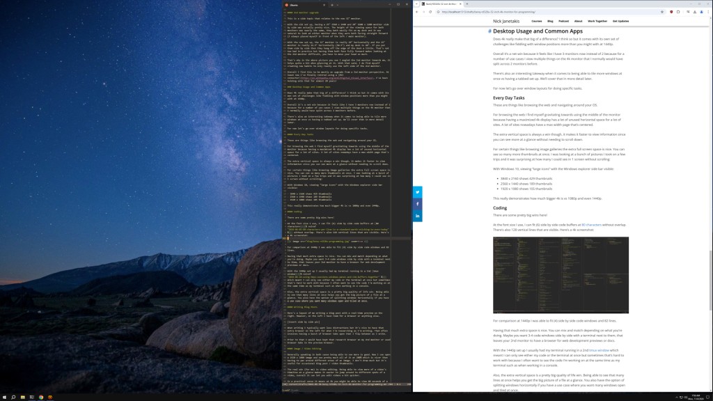
When writing I typically want less distractions but it’s nice to have that extra space on the left for when I’m researching as I’m writing. That often involves having a bunch of browser tabs open that I flip between as I write.
Prior to that I would have kept that research browser on my 2nd monitor or used browser tabs in the preview browser which meant more flipping between views.
When writing I sometimes like to day dream, even if it’s only for a few seconds. Having my 2nd monitor empty gives me an opportunity to gaze at my wallpaper and get lost in my own thoughts. This might seem minor and even weird but I like it and it makes me happy.
Image / Video Editing
Generally speaking in both cases being able to see more is good. Now I can open a 1920 x 1080 image and see pretty much all of it at 200% which is nicer than having to pan around different areas of an image. I don’t draw much but it’s useful for occasional blog post / video thumbnails.
The real win (for me) is video editing. Being able to view more of a video’s timeline at a glance makes it easier to jump around to different spots of a video, overall it can let you edit videos a bit quicker and makes you feel less claustrophobic.
In a practical sense it means at 4k you might be able to view 60 seconds of a timeline but only 40 seconds at 1440p. That might not seem like a lot but it makes a real difference.
Oftentimes when video editing and making cuts, it’s important to be zoomed in so you can make cuts at very precise moments (frames). The more you’re zoomed in, the less total time you can see at once so being able to see as much as possible is helpful.
Having a Tiled vs Tabbed Workflow
Tab driven set ups are great for focusing on 1 tab at a time. It also lets you maximize a limited amount of space. For example you can have 10 browser tabs open but only look at 1 at a time. This can be further expanded to include virtual desktops too, for example you can bounce between as many as you want to see a focused set of windows of your choosing.
Tiled driven set ups are great for viewing many different things at once. This could be anything such as what we covered in the previous sections. For certain problems being able to see more at once is really helpful to see how different pieces of something fit together.
This 4k set up lets me tile more things at once which I consider a legit win when needed. One day I wish I could have a display mapped to every surface in my work room with some type of input device that’s intuitive to use, that would be pretty cool. For now, 4k with a 1440p 2nd monitor will have to do!
Ok, so we’ve determined 4k at 100% scaling offers quite a few productivity wins. Now let’s focus a bit on this monitor’s features.
# BenQ RD320U Features
This monitor comes with quite a few built-in features and optional software. In general the “RD” series is built around providing a nice viewing experience for software development or more generally looking at text.
The anti-glare Nano-Matte finish helps a lot. I don’t see a hint of my reflection or my ceiling lights when looking at the screen at a normal viewing angle.
Additionally there’s a number of eye-care features such as being able to adjust colors with dark and light editor themes to help reduce eye fatigue.
If you have sensitive eyes then this monitor might be exactly what you’re looking for.
Optional “Display Pilot 2” Software
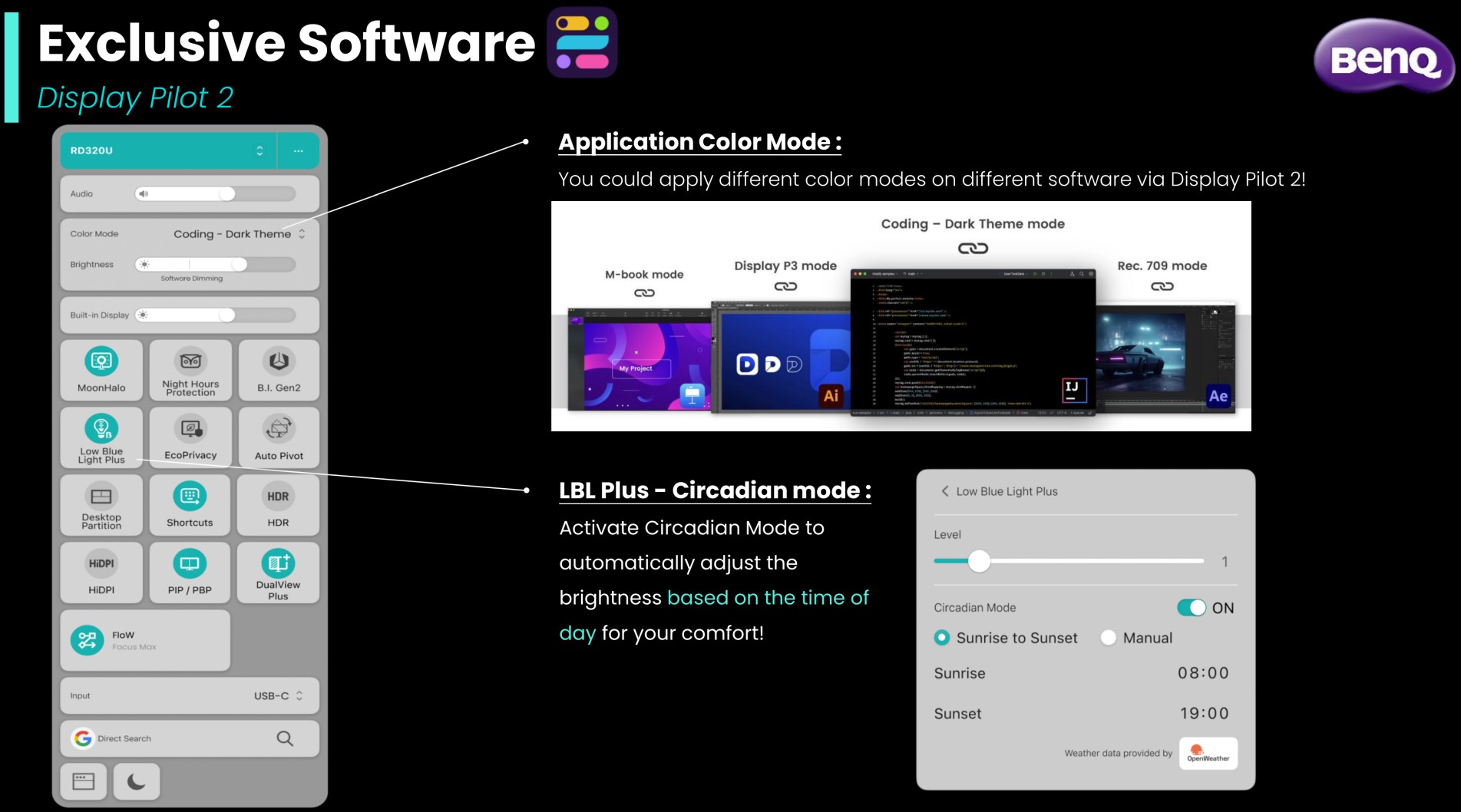
This is what allows you to adjust a whole bunch of settings such as having your brightness get adjusted based on time or the ambient light in your room.
There’s all sorts of things included here like “HiDPI” for macOS users which enhances text clarity as well as prevent scaling issues. I don’t have a Mac to test that on but it’s a toggle in their software.
Another neat option is “Flow” which lets you set custom color modes based on the time of day. If you have predictable work loads and enjoy that sort of thing that’s a nice to have.
In all honesty I didn’t spend a lot of time using these features. I’m very picky in how I use my computer. It’s in a controlled environment with lighting that doesn’t change unless I turn off my lights on purpose.
I don’t want properties of the monitor to change based on time. I also hate mouse acceleration. That’s a weird aside to add but I think it fits haha because the takeaway is I want consistency and full control on how things happen.
Also…
At the time of this post I only see this software available for Windows and macOS. If you plan to pick up this monitor, use this software and use Linux I suggest contacting BenQ. Perhaps they can add support for this at a later time if there’s enough demand.
The monitor itself works fine in Linux though, I hooked it up to a native Linux device running Arch Linux. It’s great!
Color Modes / Dual View
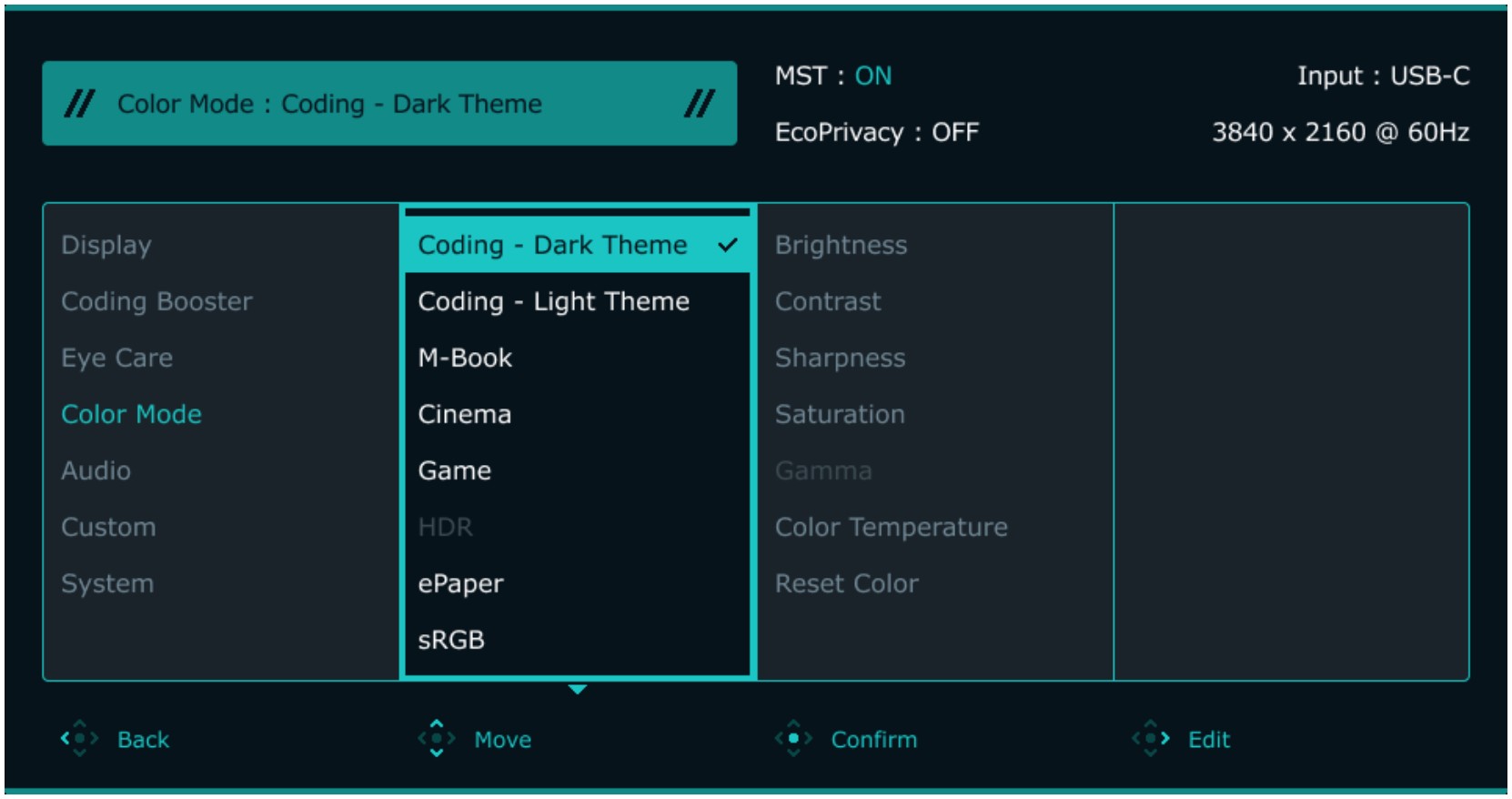
There’s a bunch of different color modes. When picking either of the coding specific modes the contrast is fantastic, these are considered “coding mode”. If you want high contrast options available without needing to set or pick specific editor themes this monitor is great.
Here’s what their documentation shows for both coding modes:
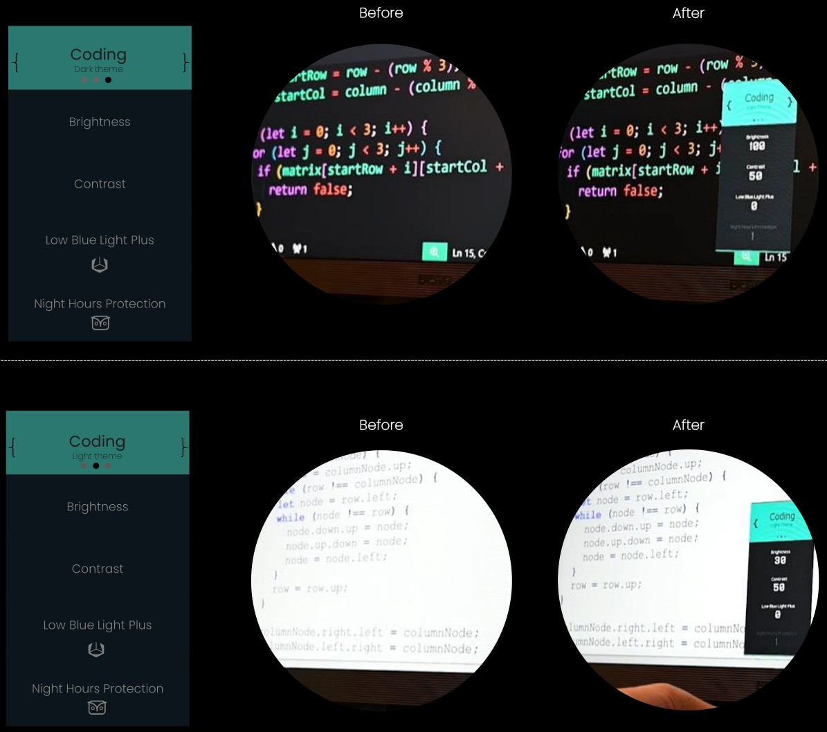
If you check the before and after you can see the after has clearer text. In my opinion I didn’t notice that much of a difference. Text is ever so slightly more refined in these modes but it’s not as much as the above screenshot shows.
The above also doesn’t show what happens to the rest of your screen by default. It will darken everything else to make text pop out even more. This is good for viewing text comfortably but bad for color accuracy.
Now, you might be thinking “Is BenQ on drugs? A lot of programmers are web developers and color accuracy is important, no one is going to use something that messes with the contrast at the monitor level because seeing images accurately is important”.
I literally thought the same thing. I immediately went for sRGB mode which offers a highly accurate representation of what something “should” naturally look like. That’s important for web development because you want to see what most folks will see on their devices.
However, BenQ thought of something very interesting here. It has this feature called Dual View where you can assign different color modes to different sections of your screen or applications.
That means you can choose to have high contrast text for your code editor but sRGB mode for your browser or image editor to ensure what you see is accurate.
To be fair I didn’t use this a whole lot but I did experiment with this and it works. If this is something that sounds useful to you, then you have just found a monitor that’s a really good fit for you.
To be brutally honest, I’m running the monitor in full sRGB mode and I’m not using these extra features. Now to be honest, I also didn’t switch to using a smartphone until 2021 and now that I have one, GPS and being able to take nice photos on the go is wildly useful.
Who knows, maybe I’ll warm up to these features in the future.
Function Bar
On the bottom middle of the monitor there’s shortcut controls to access the OSD (on screen display) and quickly toggle between color modes. Their manual has a bunch of details here.
One thing worth mentioning here is yes the monitor supports being able to turn the power LED off. It’s pretty bright and enabled by default.
Within the main OSD you can find that in:
Coding Booster -> Function Bar -> Power Key LED
Backlight
They have it labeled as “Moon Halo”, it’s in the OSD under Coding Booster -> Moon Halo.
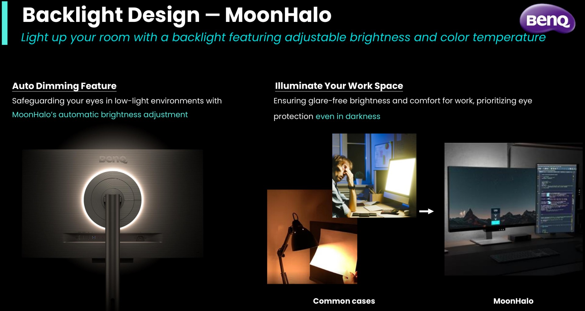
Ok, this one is pretty neat.
I didn’t think it would make an impact but I was wrong. If you like working with your lights off in a dark room this really makes a difference. It’s hard to explain but it softens the difference between the darkness of your room and the brightness of the monitor.
I don’t know if I’d say it’s reducing eye strain but maybe? I will say it has an immediate effect of making it easier to see what’s on your screen. It absolutely reduces the harsh difference in contrast between dark and light and doubles as a little desk light.
Ok BenQ, you got me. I really do appreciate this feature and will use it in a dark room.
Build Quality
The monitor feels quite solid and the stand is great. You’ll almost certainly be able to find a height and angle that works for you, and if you were a giraffe you could even rotate it 90 degrees to use it in portrait / vertical mode.
With that said, I don’t plan to move it around much. It will stay planted on my adjustable standing desk. I have full confidence it won’t slip.
# Would I Buy the RD320U?
I think a more accurate question is would I buy this monitor for $650?
I feel like a jerk saying no since BenQ was kind enough to send me the monitor, but I can’t justify dropping $650 for a 60hz monitor. That’s because I find features like refresh rate more appealing than eye-care features as we approach this price range.
120hz+ offers a very smooth experience, even for office work. I tried a bunch of monitors once at Micro Center to compare. There’s 32" 4k 240hz OLED panels too, but those are in the $1,300+ price range which is not quite comparable.
With that said, if you’re ok with 60hz and some of the features we went over before appeal to you then sure, give the monitor a shot. Don’t forget about the built-in KVM switch too, a decent one is about $50 which you don’t need to worry about.
I haven’t seen other monitor manufacturers aim a product specifically at text clarity and eye-care. I commend BenQ for taking a shot at this market. I don’t think what they’re doing is a mistake. While I am writing code most days, I’m not their target audience but I’m sure this audience exists to some degree.
On that note, I want to give a shout out to BenQ. Thank you for giving me an opportunity to try out your monitor. I will be happily using it as my primary monitor for years to come. One thing is for certain, I now highly value 4k and even after using it for only a bit over a month I wouldn’t want to lose it.
The video below covers what’s in this blog post with a bit more detail.
# Video
Timestamps
- 0:57 – An older post on monitors
- 1:43 – BenQ sent the monitor as a gift
- 5:04 – Quick specs
- 12:28 – Is 32" 4k usable at 100% scaling?
- 18:24 – 32" is massive compared to 25"
- 20:21 – 2nd monitor upgrade
- 22:56 – Desktop usage
- 23:48 – Every day tasks
- 25:36 – Coding
- 30:08 – Writing blog posts
- 31:21 – Image and video editing
- 33:07 – Tiled vs tabbed workflow
- 35:10 – BenQ RD320U’s features
- 36:21 – Optional software
- 38:19 – Color modes
- 42:18 – Function bar
- 43:28 – Backlight glow
- 45:00 – Build quality
- 45:23 – Would I buy ths RD320U?
Will you try this monitor? Let us know how it goes below.