Displaying Database Results across Multiple Columns with 1 Line of CSS
In this video, we'll loop over data coming in from the back-end and display it in a responsive multi-column layout.
Quick Jump:
This strategy will work with any web framework on the back-end since all we’re doing is attaching a CSS class to a specific element in the back-end template code.
# Demo Video
Code
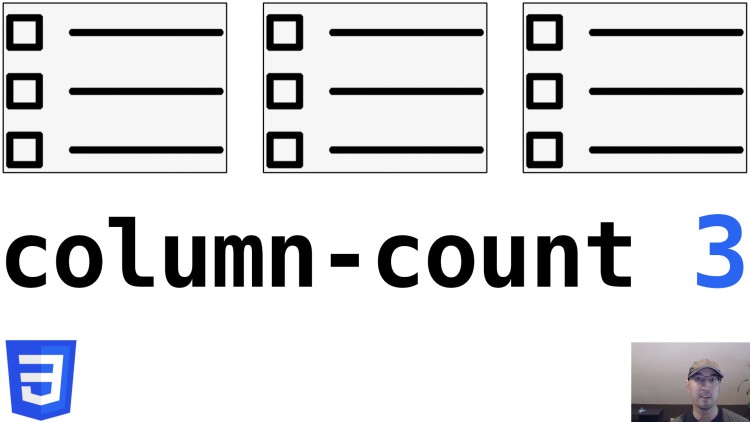
This is set up to work with Bootstrap 4 (SCSS) but column-count: 3 is the
main takeaway.
@include media-breakpoint-up(md) {
  .responsive-columns {
    column-count: 2;
  }
}

@include media-breakpoint-up(lg) {
  .responsive-columns {
    column-count: 3;
  }
}
Usage:
<ul class="responsive-columns">
  <li>Item 1</li>
  <li>Item 2</li>
  <li>Item 3</li>
</ul>
Reference links
Have you used this CSS selector to display multiple columns? Let me know below!